M&S – Speciality Range
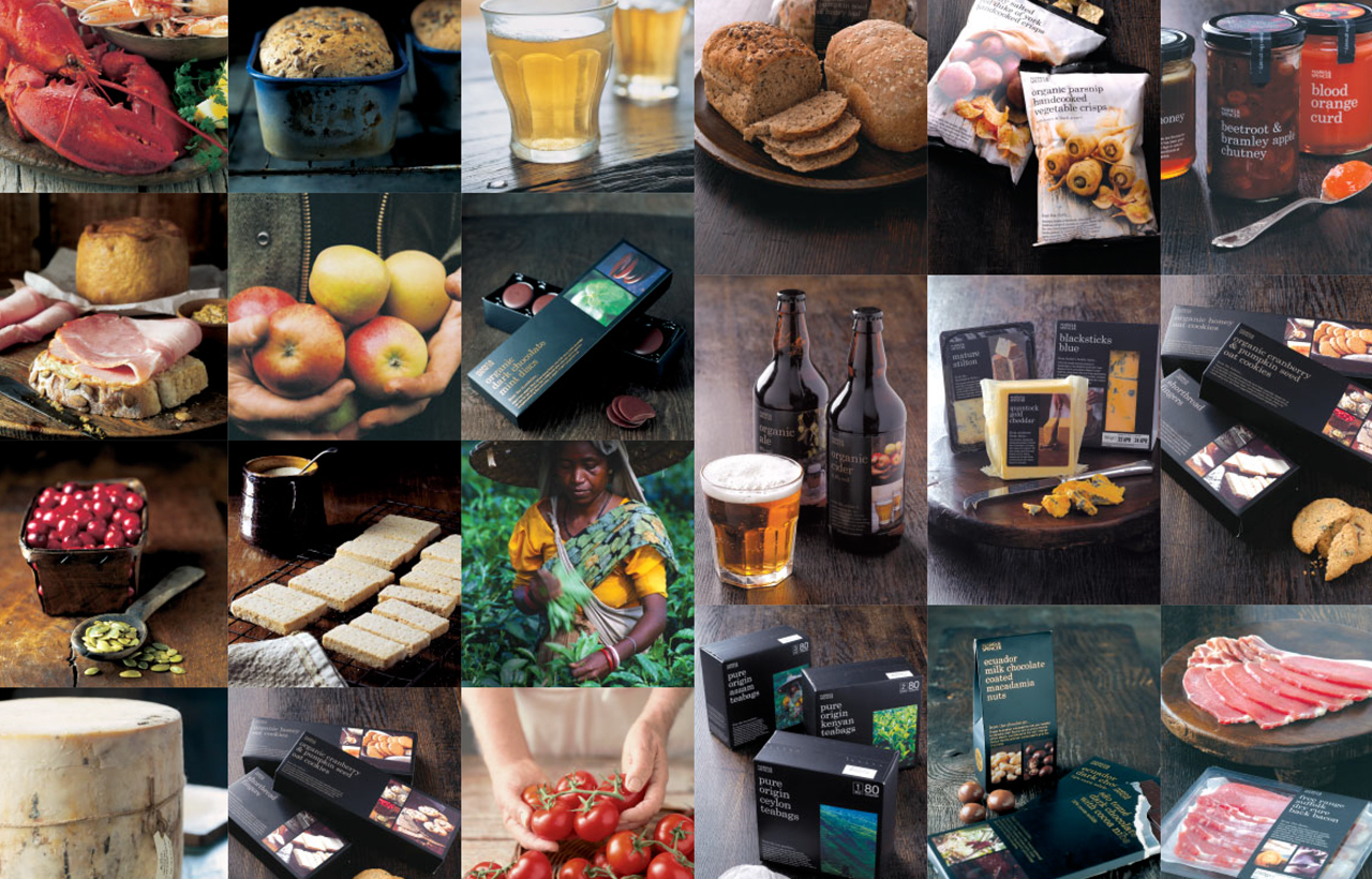
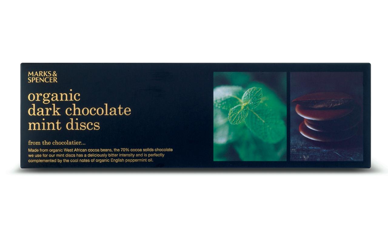
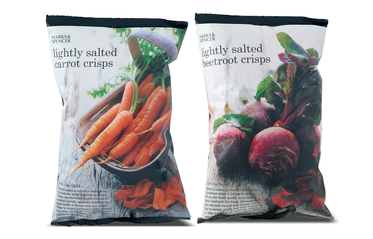
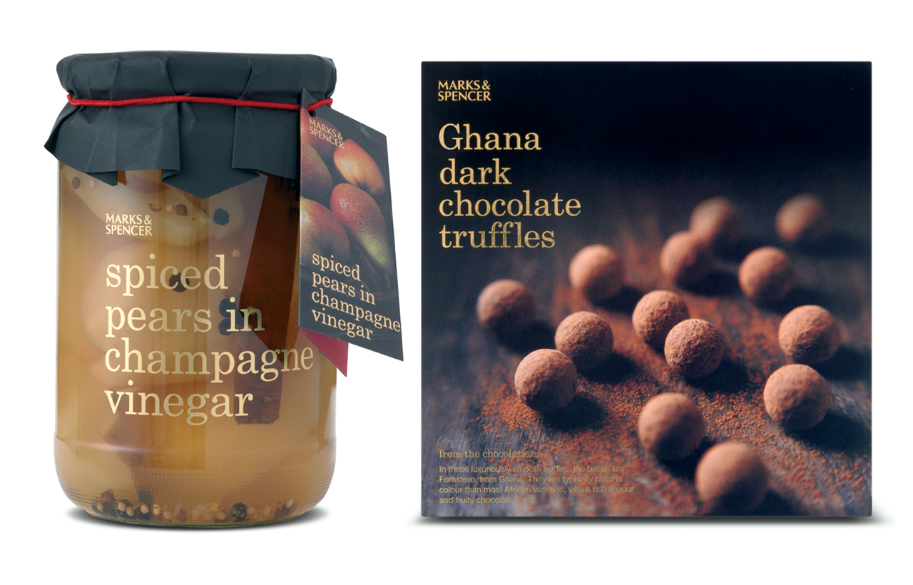
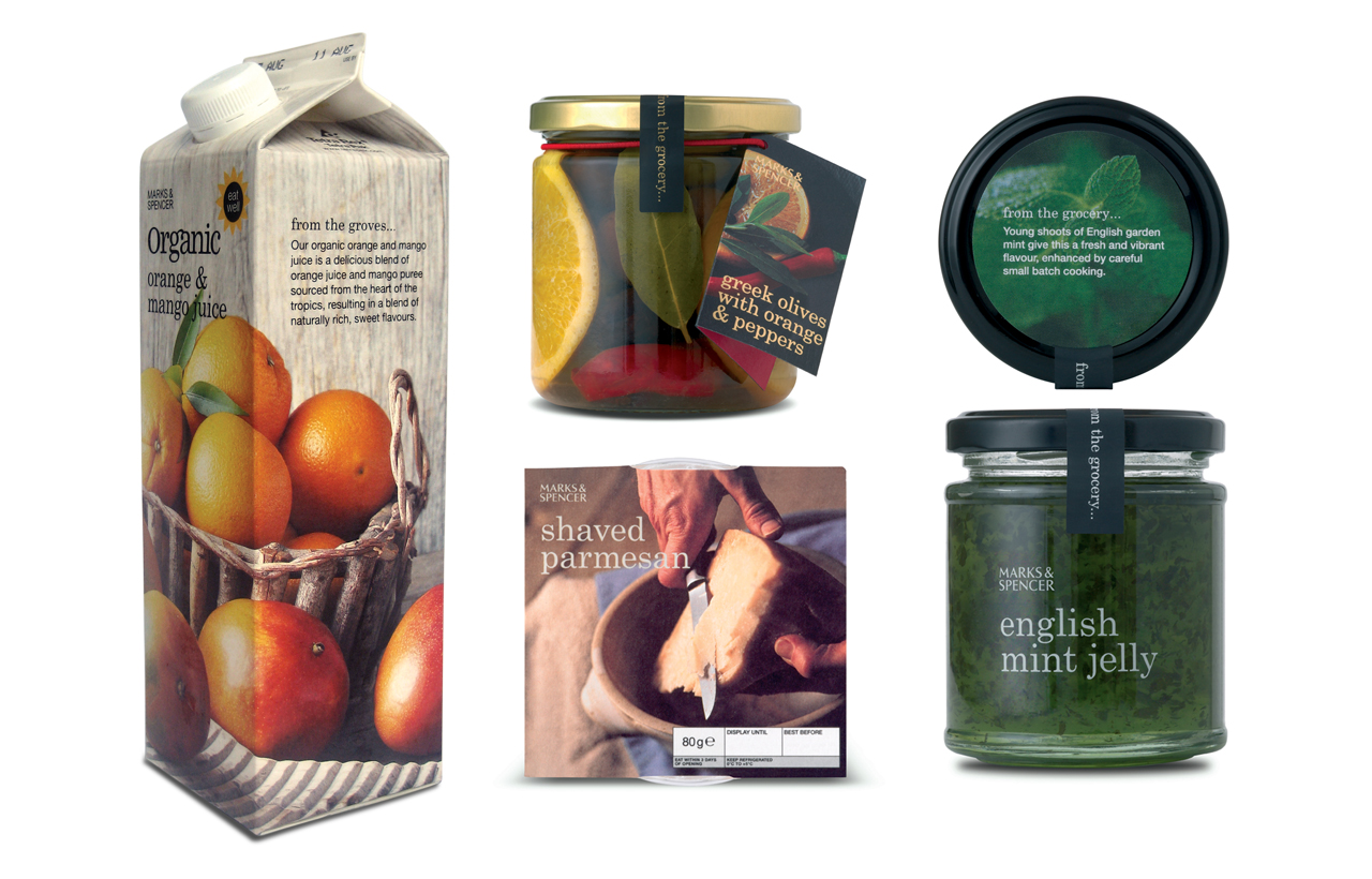
The Speciality range of food was created because more than ever customers wanted to know where their food was coming from and how it was being produced. The emergence of farmers markets and specialist food shops offering good quality British food was also playing a part in what customers were looking for. From the grocery to the farm, to the bakery and so on, the Speciality range offered customers the best tasting foods from home and abroad. I worked on this project for the best part of my 3 year contract at Marks & Spencer in London. The design reflects the quality of the product and ingredients. The use of a solid black background, neutral coloured typography (sometimes gold foil), with beautiful, rustic photography offers a design that is simple and elegant. It was my responsibility to implement the concept across every shape and size of packaging and to ensure consistency in every element of the design.
——
Client: Marks & Spencer, London UK
Involvement: Creative artworking
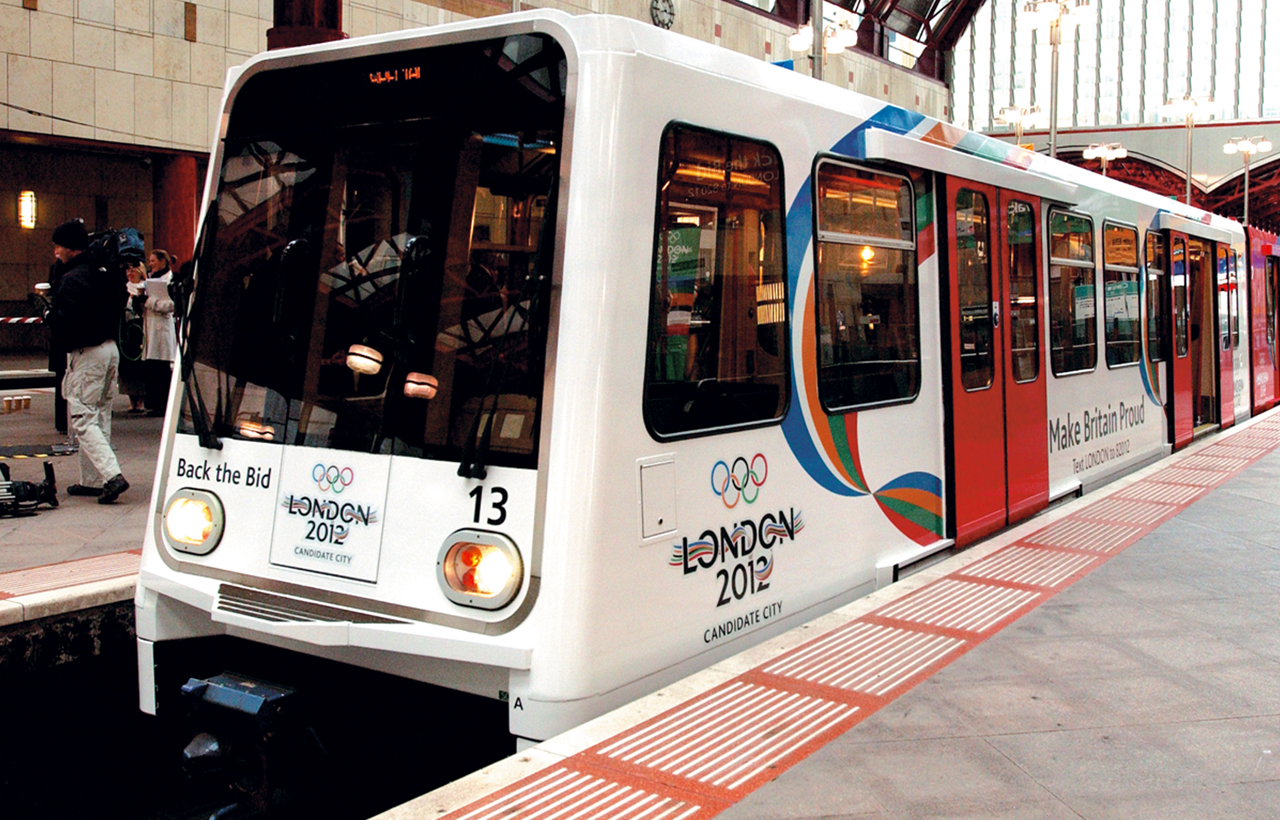
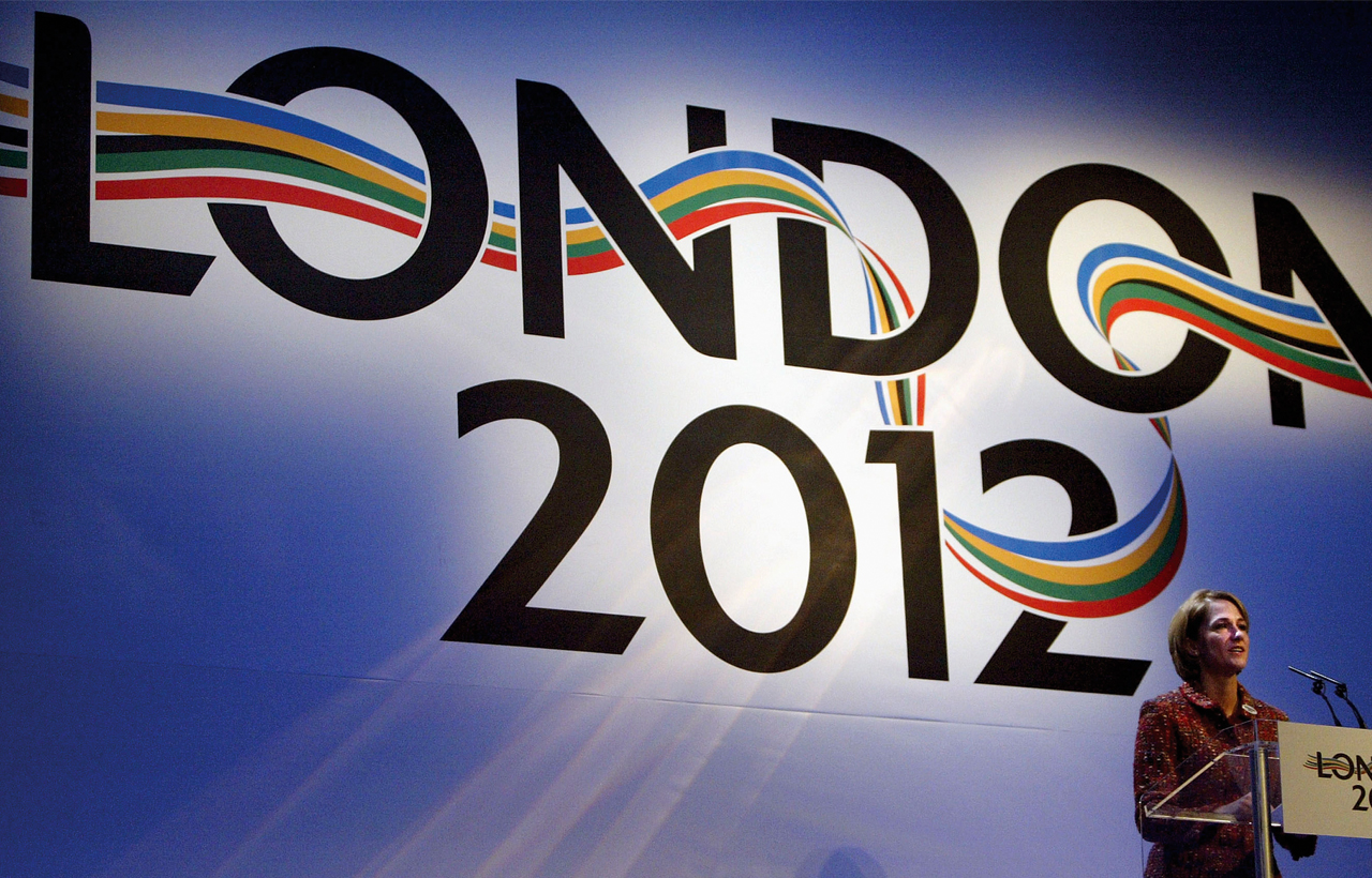
London 2012 Olympic Bid Logo
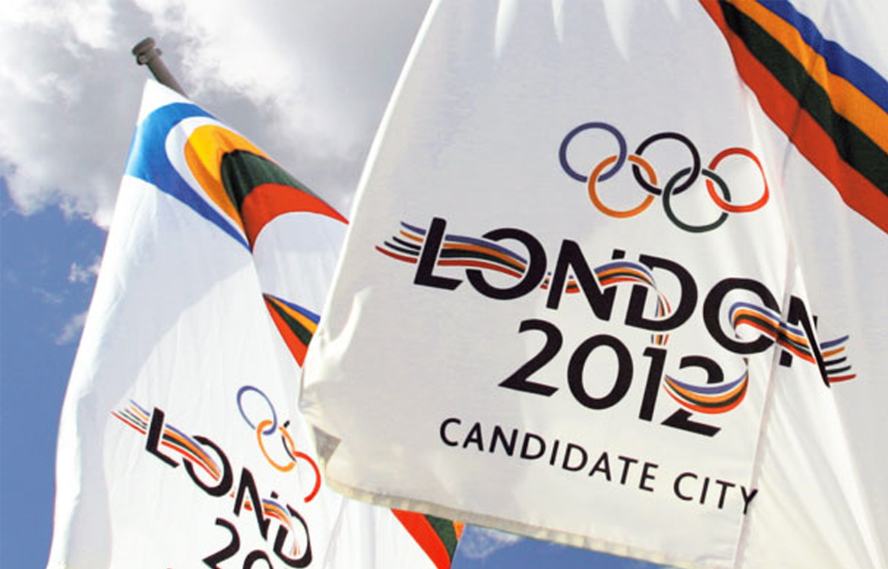
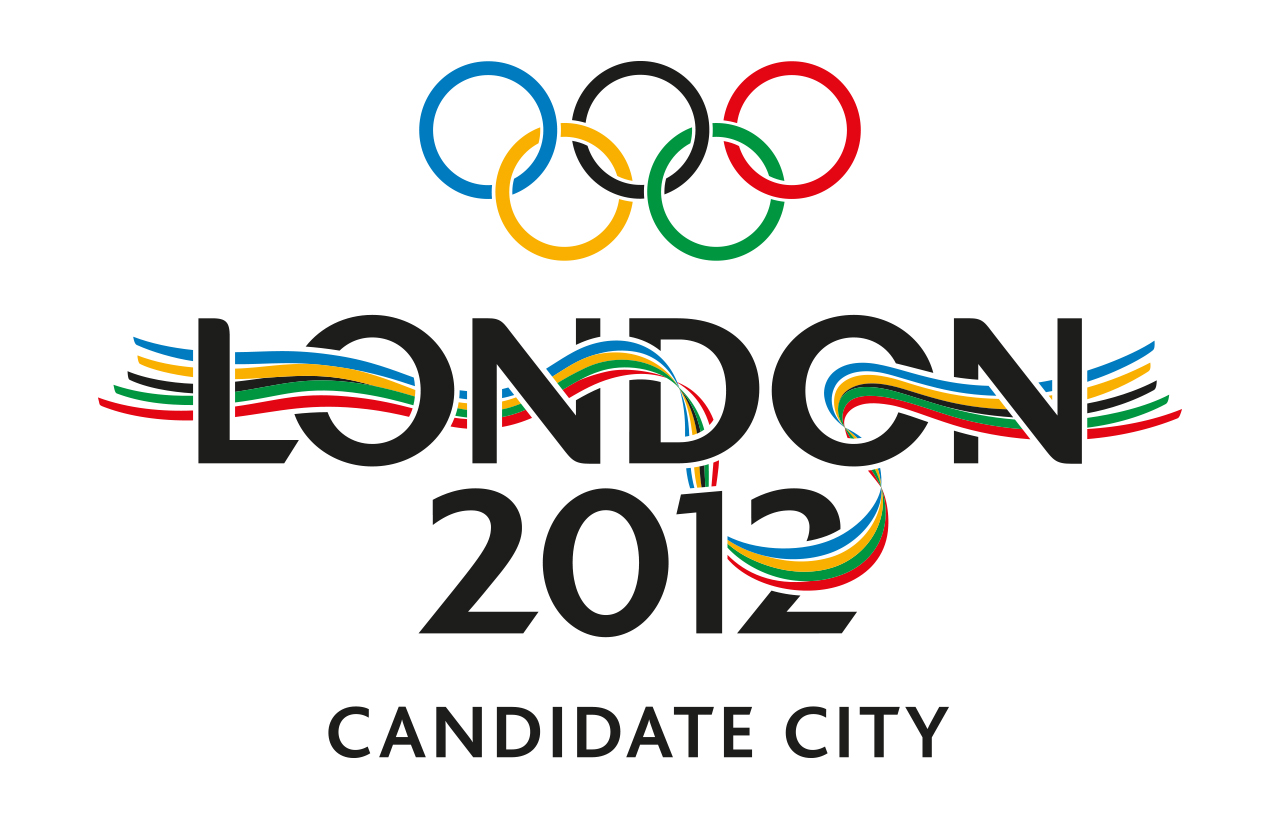
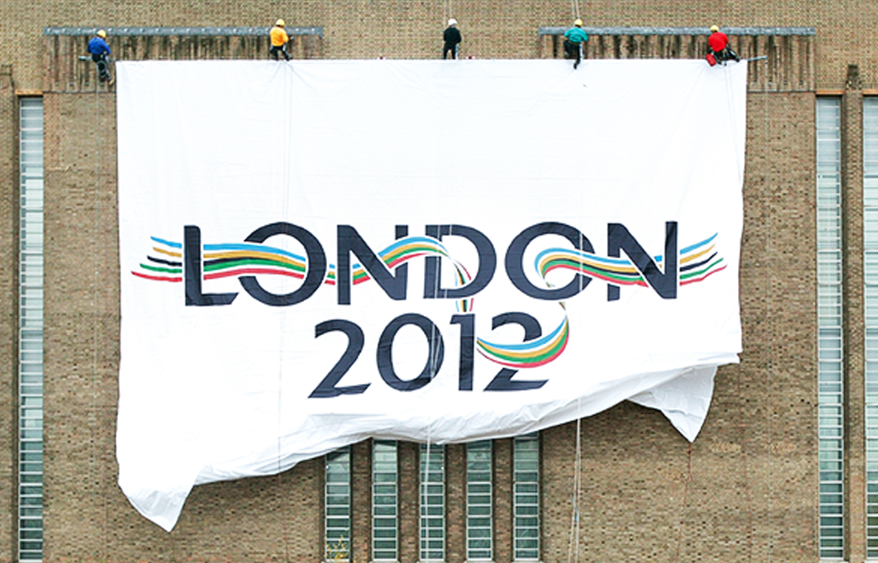
In London's bid to host the 2012 Olympic Games the London 2012 committee held a competition to find a winning logo design. We at Kino Design, entered a design and after weeks of refining it, we won! I was part of the small team that spent innumerable hours creating all the supporting advertising material, brand guidelines, implementing it across London landmarks, designing and executing the (enormous, multi-lingual) bid document – all in time to present London's bid for the 2012 Olympic games. It was an epic project to be involved in.
——
Agency: Kino Design, London UK
Involvement: Implementation and bid document design
